What Makes a Small Business Website Actually Convert?
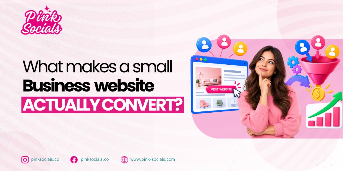
A website can look beautiful and still sell nothing, which is why so many owners are surprised that a plainer competitor site quietly out-converts their expensive redesign. This guide covers what makes a website convert: the offer, the calls to action, the trust signals and the mobile path that will convert visitors into leads, not just a pretty design.
Getting this right matters more than most owners realize. According to Guac Digital’s 2026 website conversion rate benchmarks, the median website conversion rate is 2.35%, while the top 10% of websites reach 11.45% or higher. The difference often comes down to what happens after visitors land on the page. Two businesses can get similar traffic but see very different results because of message clarity and friction.
Here’s what you’ll walk away with:
- The elements that drive conversion
- How to write a call to action that works
- The trust signals visitors look for
- The mobile path from visitor to lead
What makes a small business website actually convert?
A website converts when visitors quickly understand what you offer, why they should choose you, and what to do next. Clear messaging, visible CTAs, trust signals, and an easy mobile experience matter more than how polished the site looks.
Once you know what makes a website convert, the fix is rarely “make it prettier.” It is usually “make it clearer.” Your homepage should tell visitors within five seconds what you do, who it is for, and what to click next. If they have to scroll and guess, many will leave. Keep the offer and main CTA above the fold, and give mobile UX the same attention as desktop.
No amount of traffic fixes a site that doesn’t convert. As you’re thinking about paid traffic now, you should consider are paid ads worth it for a small business before you invest more in clicks that don’t lead to a page that’s prepared to receive them. Whether free or paid, a clear site will make every other marketing dollar count.
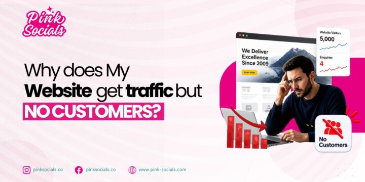
There are lots of small business owners who are attracting traffic, but it’s not converting to an inquiry or sale, and they don’t know why. To get a more detailed view of that gap, consider why your website gets traffic but not customers, which explains the most common reasons that visitors arrive at your website and don’t take any action before they ever get to your calls to action or trust signals.
What should visitors see first?
A clear headline that states what you do and who it’s for, followed by an obvious next step. If a first-time visitor can’t answer “what is this and what do I do now” within a few seconds, the rest of the page won’t save you.
Does design matter at all?
Yes, but not the way most owners think. Good design instils trust, but it doesn’t compensate for a confusing offer or hidden call to action. A simple site with a clear message is better than a beautiful site with a vague one, any time. If your current site no longer reflects what you offer, it’s worth considering whether you need a new site or a redesign before spending more on cosmetic changes that won’t fix the underlying clarity problem beneath the new coat of paint.
| Element | Job | Quick win |
|---|---|---|
| Headline | Tells visitors what you do and who it’s for | Rewrite it as one plain sentence, no jargon |
| Primary call to action | Tells visitors exactly what to do next | Pick one action and repeat it down the page |
| Trust signals | Lower the risk of contacting a stranger | Add real reviews and a phone number above the fold |
| Page layout | Guides the eye toward the offer, not away from it | Put the offer and the CTA above the fold |
| Mobile experience | Where most of your visitors actually land | Test every tap target on your own phone |
Need a second look at your homepage? Get in touch for a quick, no-pressure review.
How do I write calls to action that get clicks?
Write calls to action that convert by making them specific, visible, and low-friction. Tell visitors what happens next and make it easy to act before they lose interest.
A weak CTA is either too vague or too much. “Submit” gives no clue what happens next, while “Learn More” may not move visitors toward a sale. Strong CTAs clearly state the action and benefit, such as “Get My Free Quote,” “Book a Call,” or “See Pricing.”
Whether you’re driving traffic to your homepage or a targeted landing page, focus on one clear action, one message, and one place where the CTA can’t be missed.
Site speed is a factor that most owners don’t consider. A CTA that looks great but sits on a page that takes six seconds to load will lose visitors before they ever see it. How site speed affects sales covers this in more detail, but the short version is that a slow page quietly cancels out good CTA design, no matter how well the button itself is written.
What makes a strong CTA?
Action words, visual contrast, above the fold and repetition later in the page. “Get my free quote” is better than “Submit,” as it tells the visitor what he or she will receive, not what he or she is doing.
How many CTAs should a page have?
A single main action that is repeated as the visitor scrolls. Fine secondary links in the footer or navigation, but competing calls to action on the same landing page are a distraction and reduce conversions.
| Factor | Weak | Strong |
|---|---|---|
| Button text | “Submit” | “Get my free quote” |
| Visibility | Buried near the bottom of the page | Above the fold, repeated as the page scrolls |
| Number of choices | Five links competing for attention | One primary action |
| Friction | A long form asking for ten fields | One short step: a call or a two-field form |
| Contrast | Same color as the rest of the page | Stands out visually from everything around it |
These habits are consistent with nearly any high-converting website, no matter the industry. One thing that’s clear in both a plumber’s “Call now for same-day service” and a SaaS company’s “Start your free trial” is that there’s one action and one payoff if there’s any guesswork.
What trust signals turn visitors into leads?
Reviews and real photos, contact information, guarantees, and recognizable proof are all trust indicators that transform visitors into leads by letting a stranger know that you’re real and reliable enough to contact or purchase from.
Each visitor is a stranger visiting your website. Some portion of them is asking if this is a legitimate company they can trust before they give them their email address or take the phone. Trust signals answer that question before they have to ask it out loud.
Which trust signals matter most?
The most effective thing is a review and a real photo. Others took the risk first, and it worked out, said reviews. Real photos of your team, storefront or real work show that you are not a template and a real, local business. Stock photos do not carry the same weight.
Where should proof go?
Near the calls to action and the key claims, not tucked away on a separate testimonials landing page. The hesitation is highest right before somebody clicks “get a quote” or “book now”, which is where social proof, such as a review or a guarantee, needs to be.
| Signal | Effect | Where to place |
|---|---|---|
| Customer reviews | Shows other people trusted you first | Near the CTA and on the homepage |
| Real photos of your team or work | Proves you’re a real, local business | About page, homepage, service pages |
| Clear contact details | Removes the “is this a real company” doubt | Header, footer, contact page |
| Guarantees or clear policies | Lowers the risk of the first step | Near pricing or the main CTA |
| Certifications, partners, or press | Signals you meet a known standard | Homepage or the relevant service page |
One of the simplest website conversion tips is to put social proof exactly where doubt shows up, not wherever it happens to fit in the layout.
The initial click is not the only thing lost because of trust issues. Trust problems don’t only cost you the initial click. They’re often the reason a business finds itself why you get leads but no sales further down the funnel, because a lead that never really trusted the website in the first place is easier to talk out of buying.
If the site you’re looking at doesn’t have at least a couple of these signals, then it’s probably something more significant than a five-minute fix. Rather than patching the site piece by piece, it is often easier to have a converting website built for you from the ground up and have these elements built into it from the beginning, rather than adding them on after you have already started to lose leads to the cracks.
Conclusion
The conversion equation is a simple give: a single call to action, authentic trust-building signals at the moments of hesitation, and a mobile version that doesn’t obstruct the way. Get those four things right, and the rest of your marketing spend starts working harder, because you’re no longer sending traffic to a page that was never going to convert it. A plain site with a clear message still beats a polished site with a vague one.
If you’d rather have that built for you than build it yourself, Pink Socials can help.

Leave a Reply